Showing posts with label stickers. Show all posts

9.02.2022

TRADING CARDS :: Junk Food Doody Stickers


Let's look at some shit I guess...


All the treasure in all the land is funneled into the vending machines by the entrance of the grocery store. They've always been there, and if you're interested, that's where they still are: tiny works of art made of plastic, rubber, and metal, encased in translucent eggs. Cracker Jack and breakfast cereals no longer come with the perks of superfluous playthings, so keep some amount of gratitude nearby lest these too, one day, disappear. 


As a child, they were a privilege; a reward for good behavior during the tedium of grocery shopping. As a childlike adult, the only variable is that it's tougher to come by loose change. And even when the stars align, these machines are situated in such an obtrusive way that I'm overwhelmed with anxiety from shopper traffic as I attempt to lock in my answer. So typically I throw a quick glance and groove on some reminiscence that lasts the length of the parking lot. But most recently something caught my eye with enough force to lure me back, armed with metallic tender discs.


When there's a sticker machine involved I pay extra attention; I get a lot more mileage out of a sticker than a Rubik's Cube keychain or 2 ounces of neon slime. Even still, finding an appealing variety of stickers in these things becomes more & more difficult as the general themes and designs float away from my interests. But I peripherally saw food and drink labels being parodied somehow, and that's a close enough cousin to Wacky Packages to give me pause. 


Knee-deep in the hoopla, I gave this thing a fistful of quarters without investigating any further - which is really the only way to do it; this is old-fashioned gambling without the perks of pocket magnets or counting cards. You get what you get and you try to not fall to pieces when it spits out disappointment. What I thought was just a collection of consumer farce was actually more grounded in a thematic element: fecal matter. Dung. Number Two. This weird, lowbrow fascination with shit as an emoji with eyes and a mouth has never appealed to me -- it may even be the the most pure and simple symbol of people whose intellects are less-than. We're no prudes (just scroll the archives) but this has always been just bad taste with no context. 

With $2.00 in coins, I got 4 stickers - no doubles.


It was only at this point did I realize that these otherwise-neat designs only went as far as utilizing excrement. Go figure - my oversight I guess. But I'm warming up to them - the colors and logos are all pretty spot-on, and any of them on their own would be a fine addition to a larger array of gross-out references: boogers, puke, etc. I rolled the dice in a game of which I didn't fully understand the rules and it paid off in a bounty of foreign currency that has no use to me. 

Now I just need the other 6 in the set.

- Paul

2.13.2022

I Seek The Grail(s)!


I got a lotta shit. We've looked at a lot of it together, you & I, and we'll continue to do so whether you like it or not. In the meantime, we need to take a look at the shit I don't got; these are the big ones I wish I could whip out to impress you all, but I've yet to be endowed as such. These are things -- real, tangible things that are out there, out of my reach, yet they define me in an almost mathematically correct way. I'm not so enlightened that I'm beyond the value of material possessions - on the contrary, I find them to be one of the most fun and fascinating facets of existence. So I have no shame in admitting that, without these treasures in my arsenal, I am but merely an abstraction of my full potential. Join me in yearning.

- Paul


Zelda II store display

Store displays of any kind are topnotch riches - because of their scarcity, but mostly because of their beauty. So this gorgeous cardboard monument to one of my favorite video games will never not be on my radar. Also, for all its popularity upon its release, folks don't have a lotta love for this installment in the Zelda franchise anymore - which only intensifies my belief that this piece of art should only belong to me.
Estimated Value: $10,000.00


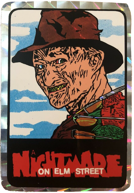
Freddy Krueger vending machine sticker

Vending machine stickers are still a thing - kinda. You can usually still grab some at the supermarket outta machines that now resemble the charred Chrysler LeBaron at the end of Planes, Trains, and Automobiles. But back in the late 80s, they seemed to be everywhere - up to & including my local roller rink, which is where I actually acquired and once owned this now-lost Elm Street sticker. It clung to my dresser drawer, illuminated in my blood-red nightlight, making sure I never slept again. I had a handful of these Horror-themed stickers, but this one is still my dream master. 
Estimated Value: $40.00


Thing t-shirt

The '91 Addams Family movie was merchandised exquisitely, and I ate its cereal and hung its posters and wore its clothes. I had an Uncle Fester t-shirt featuring Christopher Lloyd's big bald head (that I believe glowed in the dark) and I felt like magic every time I wore it. But my favorite character was (and is) Thing, and I kept a sharp eye for anything adorning the disembodied paw (hopefully a shirt). It was not to be... at least not in the US of A. Apparently, this glorious piece of fashion was reserved for Australia only.
Estimated Value: $270.00


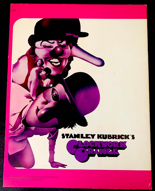
A Clockwork Orange theater programme

Alongside the iconic movie poster, Philip Castle designed tons of tantalizing images directly related to the movie, and a lotta them were compiled into this British brochure that was sold in theaters during the film's first run. 'Kubrick collectibles' is hardly an existing niche, but it's one I'd like to be a part of.
Estimated Value: $200.00


Fangoria #1

Tough to swallow that I don't already own this. The reason for that is that I'm hardly every actively chasing it - when I seek out whatever handful of Fangos I'm missing, I typically gravitate towards the articles or covers that seem most attractive. I keep stepping over this one because of its elusiveness, its price, and its crude (though I'm sure charming) content.
Someday. 
Estimated Value: $100.00


Dick Tracy McDonald's display

This is The One.
I diligently described the gravity of this grail some time ago, but ultimately its importance lies within the fact that this monument to mugshots (and McDonald's) is what sparked my lifelong obsession with this movie. And rightly so! I mean look at it: it includes nearly every gorgeous gangster that appears in the film, highlighted by a contrasting rainbow of solid hues and 3D fonts, culminating into the superlative summit of Big Boy and Big Macs. I never saw it again.
Estimated Value: n/a


"Black Album" poster

If you've kept up, you're aware of my continual declarations of squishy lust for the poster that came with The Beatles' 1968 "White Album." Well here's another clue for you all: a bootleg compilation known as "The Black Album" began circulating in the early 1980s, which consisted solely of outtakes from the Let It Be (or as we now refer to them, the Get Back) sessions. Additionally, it came with a compositionally similar (though entirely different) poster. The only way I can analogize it is: Van Gogh made roughly 20 versions of The Starry Night, and if you're a fan, each one carries as much weight as the next. Context aside, this poster knows just what I like. 
Estimated Value: $200.00


Malibu Spice poster

Adult movie posters in the 1970s were such arresting works of art that they made mainstream movie posters look like... well, like as bad as they look today. They weren't as great in the 80s - mostly swapping out elaborate illustrations and boudoir photography for straightforward 'pinups,' which has its own appeal -- particularly when the pinup is Jeanna Fine. I'm actually an enormous fan of this film, and when you pair that with the shortage of original "video posters," you've got one desirable piece of Pop to pursue.
Estimated Value: $250.00


Russ Meyer movie collection

In a way, this box of bliss doesn't actually exist - not in a regionally-compatible sense of the word. Over in Europe, they be watchin' beautifully packaged Russ Meyer discs for days, while I'm in the land of the free greasing up my DVD-Rs like some Dickensian street urchin. Arrow Video needs to figure this the fuck out and bring these bra-busting blu rays to my house some time this century.
Estimated Value: n/a


Nintendo World Championship competition cartridge

The list of sealed, mint NES games that I crave is endless, but the novelty and the context of this thing is attractive in its own way. 26 of these gold cartridges exist in the world, and they were awarded as part of the promotions for the Video Armageddon-esque Nintendo World Championship in 1990. The game consists of portions of Mario 3, Rad Racer, and Tetris, and was predictably used to gauge a player's skills. No one's impervious to the perceptible power of a golden game, but it'd also be like owning a real-life plot point of The Wizard.
Estimated Value: $2,000,000.00

2.01.2021

TRADING CARDS :: Nintendo Game Packs


 You need to understand: in 1989, any product that featured the likeness of Mario, Link, or any of their associates, was immediately more desirable and effective. Didn't matter if it was cough syrup, tax forms, or rectal thermometers - once they slapped that Nintendo logo on there, it became an officially licensed key that got you that much closer to their 8-bit fantasy world.


And these examples are not far off. The company released a handful of tangible "toys," but unlike, say, STAR WARS or Ghostbusters, Nintendo was the toy, so the merchandise they offered was both broad and weird. But, if you've been following this particular series, you know that anything and everything of cultural relevance wasn't entirely relevant until they got their own trading cards. And a cultural empire of this magnitude would predictably be handled by The Topps Company, in the form of Nintendo Game Packs.


Easily the most boring, clinical name ever bestowed upon anything having to do with video games or bubblegum cards. But at the same time, it also kinda works because there's never really been such a literal grouping of words applied to this medium. To reiterate, the gaming console was the real toy, so the marketing team and concept artists and everyone else involved in the inception of these cards clearly decided that static artwork on small squares of cardboard was an inadequate representation of the source material. In other words, trading cards belonged to our parents, but we were growing up in the techno future. Consequently (and this is the editorial part), these little brightly-colored masterpieces of 1980s pop culture were compromised and corrupted by little gray invasive scratch-off circles. Observe:


This should've been the most magnificent card series ever gifted to us by our corporate masters - but they went ahead and fucked it up and contaminated the otherwise-sexy concept of transferring the games' booklet artwork onto small, manageable canvases. What a waste. I don't even remember what the scratch-offs revealed - I didn't care. I was too distracted with melancholy and rage.

So, because of this, the cards were never really the draw. Par for the course, the series also included stickers, and it was anything but a "subset." Other card series (depending on the subject) would average out around a total of 11 stickers to amass. Power Packs offered 33 stickers(!) as part of their complete set... and those were the salt & ketchup on these undercooked fries, and they're what we're gonna look at.

Every one of these stickers depicted a "classic" image, but these are 4 that I can actually talk a bit about.

- Paul


#1

Well, they did it. They've gone and put a box on a sticker - and I, for one, couldn't have been happier. I never miss an opportunity to point out that the Super Mario Bros. 2 cover art is one of my favorite creations in any medium; the blues & reds & pinks & greens all gelled together into some sorta soda/cereal/candy hybrid that resulted in love at first sight on a momentous evening at the video store.


This sticker, on the other hand, is a bit of an unfair downgrade to the original's luscious luster. Still though, the composition is in tact, and I can't get too bummed on the whole screen print Pop Art vibe.

#2

Out of context, this is some pretty provocative stuff here - particularly the whip. And apart from the addition of color, this is exactly how she's depicted in the Double Dragon manual. Sadly, they're both confusingly inaccurate; the gameplay physicality of Linda was way cooler & more badass. She looked less like a Charlie's Angels iron-on and more like Lucinda Dickey in Breakin'.


To be honest, had they illustrated a more precise portrait, I think we'd be talking about a tattoo here.

#16

I don't remember ever seeing dreamy-eyed Mario in any of the game manuals, but it sure worked well for the Nintendo Valentine's Day cards. Those were remarkable in & of themselves, and most of these stickers pay tribute to them in more ways than one.


But the sentiment in this one is just so innocent and precious; at the time, we had no way or cause to adorn tattoos or bumper stickers, so we'd peel & stick this to the cover of our Five Star so our classmates could know just how we felt.

#17

They weren't entirely particular when it came time to decide which images they were going to repurpose. Frankly, without the context, these are some awkward stickers.


Incidentally, the coolest part isn't even the die cut portions: the repetitive "LINK" border is an effective piece of art that was probably discarded once the stickers were peeled & gone. Me, I would've extracted it in some way and used it for something -- probably as a template for a tattoo.

8.26.2020

5 B-List MASCOTS That Stole My Heart


Let's talk about sex, ba-by! This kinda stuff is the only reason for doing this site!

Ronald McDonald. Tony the Tiger. Mr. Clean. Sovereigns of Shill. Professionals of Promotion. These colorful characters managed to transcend their respective barking duties and become symbols of consumerism, as well as icons of popular culture. (Except for the Geico characters - fuck all of them.) But let's face it - we all get 'main-character fatigue' -- or maybe it's just me. Or maybe I just made up that phrase as a lead-in to what I really wanna talk about: B-List Mascots.

"B-List" not because of the quality of the character(s) or their ability to sell whatever, but because their existence and/or popularity is very much caught in a very specific time - and so, if you remember them, they become logos not for stuff, but for life. And as a member of a corporate-owned capitalist country, these characters didn't need syndicated storylines or three-dimensional depth for me to kneel and worship. (Some barely had names.)

I'm gonna forgo the history-lesson structure (which hopefully excites you as much as it does me), and just share my own thoughts/memories regarding these marvelous marketing maneuvers. And if I do my job well, you'll get strong cravings for cheese, toothpaste, and beer.

- Paul

Cheesasaurus Rex
Kraft Macaroni & Cheese

I'll be honest, this is a pretty soft open; this is one instance when the product was considerably more interesting than the character. That's because macaroni & cheese already had (and has) a well-established fanbase, and I certainty wan't so persnickety to not be a part of it. That aside, this orange dinosaur was pleasant enough with a nice, warm look -- until it eventually became a monstrous 3-D experiment. But the thing to note here is: in the 90s, cheese was big. Everything became "cheesier" and "cheese-stuffed" and "now with cheese" and cheese, cheese, cheese - and more than any other demographic, they wanted kids to know that "more cheese" meant "more important." I certainly fell for it, and I'm still under that spell.

Mac Tonight
McDonald's

I feel like Mac is sorta the Waldo of Bennett Media; if you browse our archives, chances are he'll always pop up eventually. The reason for that is rooted in the strong, nearly-inexplicable draw I've had towards him since I was roughly 4 years old. McDonald's has had many faces, and most of them resided in the same McDonaldland that we're all so familiar with - but this bizarre creature of the night had his own agenda; a sort of "McD's After Dark" if you will (won't you?). I don't know if it was just an early fascination with the moon, or with sunglasses, or with exceptionally happy monsters, but when you put all those together, this guy was practically a Dick Tracy villain before I even knew Dick Tracy. Anyway, I have him tattooed on my right arm.

Sparkle Crest
Crest For Kids

Big ups to Crest for fully understanding what they had; the biggest attraction about this stuff was its shimmery blue color & texture, so they literally used the gel itself to create a group of singing & dancing blobs. So it didn't matter that it was toothpaste, or even that it came out of the tube in the shape of a star(!) - this whole transaction was grounded in glitter and the hypnotic powers of blueness (because all the best drinks and snacks of that era were blue). Also, sunglasses.

Elvira
Coors Light

Because of my age, this is most likely how I became aware of Elvira. Frequenting an endless parade of convenience stores, it was only a matter of calendar months before Halloween rolled around... and then she would arrive: 6 feet of cardboard and carnality, all in the name of Coors. But it was never really about the beer - in fact, this was working in the complete opposite direction of Joe Camel or Spuds MacKenzie; the combination of boobs and brew wasn't luring me into adult beverages, but rather legitimizing the idea that even adults could celebrate Halloween. And so I knew that, as I got older, I would never have to give it up.

The Handi-Snacks Guy
Nabisco Handi-Snacks

At some point in the late 80s (before Kraft acquired the product), a box of Handi-Snacks came with a sheet of Handi-Snacks-inspired stickers, and I still have them stuck to my toy box - one of which is this. To the best of my knowledge, this guy (I call him a guy because they didn't give him big lips and long eyelashes) didn't have a name. Honestly, I don't think he was even an actual mascot - but he sure-as-heck coulda been. I mean, he's basically a California Raisin with a cheese crotch, which is the simplest formula for branding: strip a product down to its bare ass, then take the Mr. Potato Head approach.
If anyone knows his name (or wants to give him one), please, lemme know: at which point, I will get him tattooed.*

*Who'm I kidding, I'm gonna anyway.

4.10.2020

TRADING CARDS :: Wacky Packages 1991


Y'know, there are a handful of things - interests, hobbies, obsessions - that I hold off on writing about because I assume I've already written about them at least a dozen times. And then there's the happy/embarrassing realization that I haven't - I'm just thinking about them all the time, and my boundaries between reality and fantasy are all fucked up. Topps Wacky Packages (or "Wacky Packs") is one such obsession that I never don't wanna talk about. To put it another way (without the confusing double negative), when I'm in the right mood, I feel like I could just dedicate the entire site to these colorful stickers (except that there's about 70 other topics for which I'd do the same).

If you don't already know them, Wacky Packs is a sticker series, and each sticker kinda 'parodies' a different 'product' with the use of gorgeous artwork and bad puns. (If you're at all new to this, that description may sound vague, so let's clear that up right now...)

The first series debuted in 1967, and there've been, like, 20 more series since then - all the way up to present day.

There was a bit of a dry spell in the 80s, ironically due to the fact that one of their unpublished stickers - a takeoff on Cabbage Patch Kids - went on to have its own wildy popular series of cards titled Garbage Pail Kids, thus stealing the spotlight in the 'Topps gross-out parody' genre.


I became aware of Wacky Packs when they released a new series in 1991. For slightly older folks, it may've been a bit of nostalgia; for me, it was new, exciting, and all around bizarre. C'mon, it was downright wacky!


I can't be entirely sure of what the appeal of Wacky Packs is to other people -- and if they flat-out don't appeal to you, we can never really be "friends" in the true, pre-social media context; I mean, I'll continue to be courteous and receptive to courtesy, and maybe feign interest in whatever you're into, but you'll never be part of my world.

I digress, though. The point I'm trying to make is that I assume that other people (and by that I mean other kids) maybe responded to the boogers and throw up-type stuff or the wordplay (which could be funny at times), but for me, this was just an ode to labels, logos, and advertising. Had these been stickers of actual products and brandnames unmolested by satire, I might've loved them even more. If you've paid any attention to this site for the past 10+ years, does this really come as any surprise? I'd probably eat cilantro-flavored Peeps if they were packaged in an interesting way - because I wanna point out that, while these depictions are all just a big gag, the artwork is spot-on, hammering the spike between real and surreal.

The 1991 series hit me just at the right time; not only did the collection of 55 different stickers parody the products I was already consuming (video games, action figures, trading cards), but this was around the time I started to really notice & study all kindsa labels & logos: from Cosmo to Colgate to Chrysler, all these designs and color schemes began to speak volumes to me, and so to have collectible stickers that celebrated this awakening was a gift from God (or The Devil - it didn't matter).

I "peeled here" and stuck there to no end, all over every bit of wall and furniture that was bestowed upon me as "my own." Over a decade later I reacquired the set, and I am now much more conservative with stickers (as in: I Don't Stick Them).

I love them all so fucking much, but here are 10 standouts from the 1991 series of Wacky Packages.

- Paul

"Stupid Moron Bros. 2" (#4)

This is an easy one to love -- Super Mario 2 is my favorite Mario game for a million reasons, but close to the top of that list is because I love the box/logo so much (SMB 3 is a close second). This illustration (like all of these) is close enough to the original to love it just as much. Though, it's funny: for all the little things they change into jokes, I never understood why this box contains a cassette tape rather than a game cartridge.


"Vlad Bags" (#9)

Cartoon Draculas are always gonna be my jam - not to mention cartoon bats, cartoon graveyards, cartoon anything Horror that could at all resemble cardboard Halloween decorations. I also love that the exposed corpse arm completely changes the boring rectangle shape of the sticker.


"Bambo" (#21)

I thought Disney was kinda lame when I was a kid (oddly because that's how I was raised), so I suppose anything that made fun of their catalog seemed 'edgy' to me. All of that aside, this is still a wonderfully violent cross-pollination of two pop culture icons that still holds up.


"Newpork" (#28)

I'm just so pleased that even into the 90s they were still lifting cigarette and alcohol labels for their stickers. But that was the point - I wasn't a smoker or drinker when I was 8, but I knew this package well, and so did every other kid: if you blur your eyes, it's immediately recognizable as the original thing, because this whole deal celebrated consumerism at its blissfuly shrewdest.


"Fatman" (#34)

Here's a good example of how they wouldn't exactly spoof an entire institution, but a specific product - and this was specifically the Batman action figure that everyone had. It's also a good example for pointing out that whenever you can find any text on the art, you know you're in for a punchline. It's also a good example of tiny food illustrations.


"The Real Gross Blisters" (#35)

Again, not exactly Ghostbusters, but Ghostbusters cereal, which, between the animated series and the sequel, seemed to stick around for a lot longer than most tie-in cereals. And like the Mario sticker, it's just close enough to the original to stir up excitement for... well, the original.


"Oldage Mutant Nasty Turkeys" (#36)

I can't believe I chose ten of these things - I mean, I love them all, but it's pretty self-explanatory at this point. For this one, I say sit back and just enjoy how wonderfully they turned "Turtles" into "Turkeys" while maintaining that same detectable design. Also, "Inaction Figure" is just funny as all hell.


"Sick Tracy" (#48)

Well this is timely and relevant - we just went over the advertising thunderstorm that Touchstone put our young minds through, and here's a pretty honest commentary on it. Of course, when I first got this sticker, that subtext didn't resonate with me: I just thought it was Dick Tracy throwing up, so he was "Sick Tracy." Ignorance is bliss.


"Mummorex" (#49)

This is close enough to the original that I just started referring to Memorex as "Mummorex." This was possibly the happiest marriage of two things, because, I don't know about you, but most blank tapes in my lifetime had at least one Horror movie on it, so this gelled so fluidly that it was easy not to even notice the farce. Plus that cartoon pyramid is just delicious.


"Snot 'n Blow" (#51)

My mom used Sweet 'n Low, so it was always in my line of sight - so, that made it super nostalgic for me even while it was happening presently. And, again, the transition is so seamless that one has to do a double-take to see there's comedy going on here.