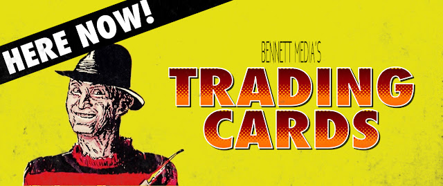
Since its inception, the internet has been about 3 things: pornography, the pineapple-on-pizza debate, and Fright Flicks. It's hard to find a blog that has yet to publicly praise this absurd card collection that totally defined an era merely by existing. Because of this, I've hesitated discussing them; plagued with apprehension that I'd have nothing fresh or insightful to bring to this childhood rite of passage (and now 'memory lane' mainstay). But then it occurred to me: when the hell have I ever let that stop me before? Besides, if we're talkin' about major Heebie Jeebies, these cards were some of my first.
Before I ever got my hands on a Fangoria, these graphic, gratuitous, colorful cards were little windows into a decade of Horror Cinema that only intensified its mystique; it was like having the Horror aisle from the video store in my own home. The set consisted of 90 cards and the traditional 11 stickers, and they all depicted publicity stills from 14 timely Horror flicks - a list so eclectic and exclusive that I can't wrap my mind around whatever licensing deal they made.
As everyone points out, each grizzly image is accompanied by weak humor and bad puns - like an extremely dull shade of Crypt Keeper comedy. We collectively assume that the thinking behind this was to destabilize the gruesomeness depicted within this typically juvenile institution, but to 5-year-old me, this attempted silliness had a paradoxical effect: making light of these horrible things created the same dark mood as Freddy's wisecracking. The fact that they were joking about these rotting faces and exposed guts made it that much more sadistic. But what it really came down to (and it was noticeable even then) was that the writer(s) of these captions was/were clearly not familiar with the films represented -- and that's funny.
But most of this stuff has been well documented, so let's get subjective. This whole set is a parade of repugnant nostalgia, but I've singled out 5 worthy specimens that come with some personal baggage that I need to unload.
- Paul
#29
Two things to mention here: one is that this card forces one to realize that An American Werewolf in London is actually pretty lite on werewolf imagery - which, while it was clearly a technique to disguise potential faults in the special effects, it's still entirely effective and I wouldn't have it any other way. The second thing worth mentioning is this: when I began collecting these cards, I'd only ever seen the film on TV, edited for TV. And the thing about the TV version is: this scene doesn't exist (and understandably so - it has no plot function, and there's no way to soften this sequence). So, imagine my puzzlement when I unwrapped this image depicting some sorta Gestapo Wolfman from a movie that, in my mind, didn't really support such a scenario. Needless to say, it confused me in a daunting way for several years.
#39
I've never been shy about admitting that I think the original Ghostbusters is scary - and I never believed it was any kinda residual shock or terror from watching it as a toddler; this isn't merely a case of kindertrauma. With the exceptions of Slimer and Stay-Puft, the arresting imagery from this movie effortlessly holds its own against a lotta these hard-R heavyweights. And once they all share this same crude paper stock, the Comedy/Horror boundaries get fuzzy, and we're left with a total protonic reversal.
#65
Pumpkinhead received quite an honor being amongst this company, as it was the newest movie featured in the set. So new, in fact, that the images are credited to Vengeance: The Demon - the film's original title all the way up until right before its release. Heck, for all I know, this whole card series might've just been a vehicle to sell the movie.
To be fair, it was and still is one of the coolest looking creatures to ever appear on screen, but was sadly bogged down by its own movie (and franchise) that was too boring to support it.
#79
Boy, if there's a concept that both haunted and defined my youth, it's "TV Freddy." I'd not yet seen Dream Warriors when I was repeatedly confronted with this ghastly gag (the sequence is featured on 2 different cards and a sticker), so I was hardly aware that this defining moment actually marked the beginning of "Funny Freddy." But out of context, this gives off an entirely unsettling vibe: from the bleak ambience of the lighting and set design to Freddy's emotionless prosthetic head that doesn't even bother making eye contact with his victim -- per usual, the story in my head was scarier than what the movie had to offer. Bitch.
#88
I'd not seen Predator until I was nearly a teenager, but I was very much aware of the monster itself (I had no idea it was an alien). Between these cards and the prismatic vending machine sticker stuck to my bureau, I was left only to imagine who this character was and what its motivations were. And imagine I did: to me, he appeared to be someone in a position of evil power that you'd have to go and grovel to, like Jabba the Hutt or some kinda royalty. I certainly never made the connection that he was in the movie with the generic, stylized video cover of Arnold Schwarzenegger. And even as good as Predator turned out to be, my scenario was scarier.


.jpg)


No comments:
Post a Comment