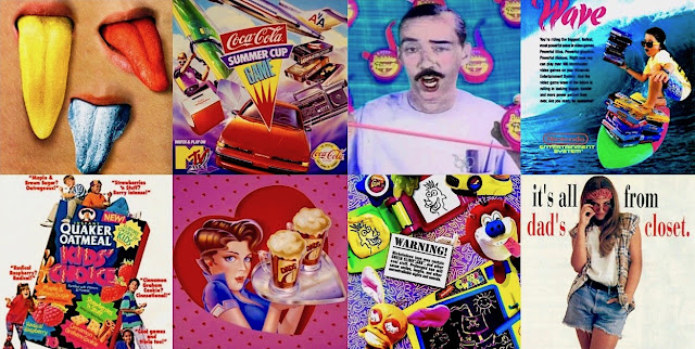
Have I made it clear enough that I have a deep, fervent lust for advertising? And not just from my own brief little bubble of upbringing; everything from circus posters to LiveJasmin pop-ups act as colorful manifestations of a time & place -- and you know I'm all about time & place.
But this, this is about commercials, which has been a rocky, long-term love/hate relationship. As an adult, I quit television for several years just to avoid them. A recent trip to the movie theater assaulted me with 25 minutes of plugs and messages leading up to the feature - so much so that I abandoned the film 15 minutes in due to some sorta accelerated spiritual atrophy. This may all sound made-up, but I assure you it's as real as my passion for the subject (for better or worse).
When I was a kid, commercials were all about candy, fast food, cereal, and toys... But I'm no fool - a lotta that had to do with the programming I was watching. And while it may seem like the only things they're selling nowadays is pills and insurance, this is not a generational thing; the fun stuff has always demanded the more colorful and creative campaigns, and there's certainly no shame in calling attention to that. So let's!
Magnolia.
"The White Album."
The Catcher in the Rye.
These three commercials.
It's that level of influence and adoration, folks. This goes beyond clever ads with catchy jingles -- nor is it just a brisk stroll down memory lane to reminisce about your favorite cereal bowl or pet goldfish. This is about ART - bold and in all caps.
These mini masterpieces of marketing ran between the late 80s and early 90s, and the Avantgarde influence of MTV, Nickelodeon, and Nintendo is clear and beautiful; these aforementioned institutions were geniuses of jerking off our already-short attention spans with a specific audiovisual recipe that turned me on in a profound way. This era introduced a bona fide Pop Art revival that's not recognized by any scholastic organization (apart from us because we bring it up all the time).
Advertising (and other) ca. 1990 was consciously evocative of the artistry and irony of Lichtenstein, Rosenquist, Warhol, and others who ridiculed ad culture and simultaneously (and expertly) simulated it.
The result is that, what we now recognize as 1990s aesthetic, is predominantly from the 1960s. Case in point: the following three candy commercials...
Reese's Pieces (1989)
You know I love me some bold, colorful imagery contrasted against a solid white canvas - but, of course, that's the theme of the ad: a sorta 'gallery' setting showcasing various art 'pieces.' The whole look (and even the song) is conspicuously similar to the 1979 video for "Pop Muzik" by M. When you take all of this into account, it's obvious they knew exactly what they were doing: the props, costumes, compositions, and editing all had to be worthy of a museum. And so it is.
5th Avenue (1992?)
Let's start with the jingle: a sorta Jazz/Hip-Hop/Ragtime hybrid that has no business even existing, let alone being catchy. (The closest comparison I can think of is "Rebirth of Slick" by Digable Planets.) Visually, it matches all these things, and then some: animation interacting with live action, stop-motion, puppets, some minimal set dress, and a box of costumes. A mix of styles resembling R. Crumb, Keith Haring, David Lynch, Schoolhouse Rock, and Pee-wee's Playhouse. When I see a collage of this magnitude, I have two thoughts: "How did they pitch this?" and "How did the script read?" It feels like each small segment is pulled from different material - all unified in their celebration of Crunchy Peanut Butter in a Rich Chocolate Coating.
Whatchamacallit (1986)
This is the one. The pièce de résistance. It has an honest-to-goodness cult following because it transcends its benign aim to merely sell candy - it's a mystically satisfying showpiece of sensorial and subtextual symmetry; it feels like there's a lot going on, but it really is very sparse (just like the candy bar itself). There's definitely an abstract narrative here involving these comic strip-style yuppies that's indicative of the equally-cerebral Calvin Klein ads of that era. But these 'characters' are just the anchor for all the wild, rhythmic patterns and unidentified flying crafts.
If you pay close attention, the imagery is really dictated by the song - which is a tribal invocation of colloquial synonyms sung by angels. In other words, it's a phat beat with kickass lyrics and a beautiful melody, and I would appreciate any help in this: I'd like to organize some kinda petition or viral awareness to get the Haim sisters to cover this song, and maybe even elaborate and expand on it. Please, I don't wanna hafta wait till I'm terminal so I can make this my final wish -- we deserve this now.
- Paul


.jpg)


No comments:
Post a Comment