Pure capitalist, corporate labeling, conscious-altering, health-deteriorating soft drink Americana: all my favorites.
I've become less faithful to particular brands, and pledged my allegiance to all that is sweet & bubbly. (Coke still tastes the best.) But, in my yearning reminiscence for all things good & bad, mixed with an overly convoluted passion for text & color composition, right now I've fallen off the Coca-Cola wave & caught the Pepsi spirit -- thanks to their package rebranding campaign. They've wrapped up their poison in bright, bouncy nostalgia.
Bottles & cans, just clap your hands
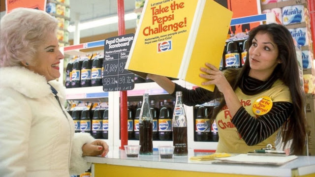
In a Coke household, the Pepsi logo used from 1973 to 1986 was in my peripheral vision as a child, & so it exists only in my outermost memory - the way the details of a dream slip away as the day progresses. That's part of the fascination, but really what it's about, and what it's always been about, are bright colors and stark images on solid white backgrounds.
It's an aesthetic composition that ignites some Manchurian Candidate-like reaction that causes me to submit to whatever pop junk they throw at me. This is advertising at its shrewdest, but at its softer, gooier center, it is, by definition, art.
Pepsi attempted this gimmick back around 2011 and they botched it severely: stamping each label with the insipidly large-print Throwback, maliciously crushing the reenactment fantasy with its bold reminder that, "this is not then, and now you live in a time when people use words like 'throwback'."
This newer facsimile is closer to the original generation (with a far more subtle disclaimer - in place for the truly dim). It's as close as we'll get, and I'll take it - because we take what they give us.
Meanwhile, Coke stubbornly holds fast; clumsily replacing the image of Santa Claus with polar bears during their holiday run, while putting people's names (?) on their plastic bottles during the summer months. They don't need anything fancy (or exciting, or innovative) and they know it.
Pepsi always had bigger stars and better ad campaigns -- they've had to try harder, and it shows.
And it works - I'm a fully dedicated Pepsi lover... until they change the cans back.
Joe Camel & Ronald McDonald would be proud.
- Paul


.jpg)


1 comment:
Big time Pepsi drinker here and I can say I am as happy as you are that the retro design is back. One thing that I thought Coke always had that Pepsi lacked was a seasonal nostalgia. The Santa Claus cans are as part of that holiday spirit as much as the timely viewings of A Christmas Story of Christmas Vacation (or any holiday themed movie on the special time of year). They also have an arm that extends further into the past. Not just by existence but by design- the Coca Cola bottle. But as far as the design of the can, Pepsi is where it's at. For now.
Post a Comment